Tea House
Developing a multi-purpose blog website for tea enthusiasts
Project Type:
University Project UX/UI Design Front-End Development
Role:
UX/I Designer UX Researcher Developer
Tools:
Figma Visual Code Microsoft Forms Excel
Duration:
5 Months May 2022
Overview
What Does It Take to Build the Ultimate Online Resource for Tea Enthusiasts?
In a society made up primarily of coffee enthusiasts, tea beverages have become arguably underappreciated and overshadowed. As part of the assignment to create a food-themed website, this project introduces "The Tea House," a comprehensive online resource dedicated to everything tea-related. Being a strong tea enjoyer myself, I always wish to learn more about the drink, its historical background, and its numerous health benefits. This is exactly what this website aims to provide for future users.
Drawing inspiration from multiple coffee blog websites and conducting short surveys for research, "The Tea House" sources everything a tea drinker might want to know about their favourite beverage. From white tea to black tea, each type has its own unique history and aroma. With a Wikipedia-like knowledge bank, users can learn more about their preferred teas and discover new ones.
Problem Statement
In a world dominated by coffee culture, tea enthusiasts often find it challenging to locate a centralized, comprehensive online resource dedicated solely to tea. The fragmented availability of information leads to a time-consuming search process across multiple websites, leaving tea drinkers without a go-to destination for their needs.
Solution
The solution is to design "The Tea House" website, a single, cohesive platform offering extensive information about tea in one place. This includes detailed articles on different types of tea, brewing guides, tea house reviews, tea ware recommendations, and a collection of tea recipes, all presented in an intuitive and user-friendly format. The website will also feature a personalized quiz to suggest teas based on user preferences, detailed guides on tea preparation, and a section for tea-infused dessert recipes with embedded videos and printable PDFs. Additionally, a social media feature will foster a community space for tea lovers to share tips, feedback, and discussions, complemented by regularly updated blog posts on the latest tea trends and recommendations. By consolidating all this information, "The Tea House" aims to be the ultimate resource for tea enthusiasts, eliminating the need to browse multiple sources for comprehensive tea knowledge.
Research
I analysed the competition as well as conducted surveys of potential users to understand their expectations and needs.
Competitive Analysis
To begin the research process of the project, a competitive audit was conducted to get an overview of websites available currently that share similarities with the planned concept for The Tea House website. Three different websites were analysed and compared for any similarities and outstanding unique features.
As this project concept was quite niche and specific, only a handful of websites were found which matched it completely, so to additionally support this, an additional analysis was held for related websites such as for coffee as that held a stronger audience.
The most common aspects throughout the audit that was worth noting was the lack in UI and the visual design of the websites. This was seen in all three of the websites that were analysed, the designs were outdated and claustrophobic which I made my goal to improve on. As for the contents, no website had all the features that my website was planned to include, only some which was taken as a good sign as it would provide an advantage amongst the competition due to the website content being for a specific and small target audience.
Overall, the websites were clearly outdated and basic, requiring a lot more attention to detail in terms of both the visual aspect and the content, creating the theory that these websites could hold a lot more success and potential if improvements were made to enhance the user experience.
Key Findings
An online anonymous survey was issued out to 20 participants of a broad demographic with a focus on their interest and passion for all things tea related to gain insight into their experiences with the already existing sources to establish pain points, critiques and expectations.
Objectives
User Survey
Key Findings
Discover participant’s experiences and familiarity of already-existing tea sources
Identify pain points and areas for improvement based on user feedback.
Determine participants' expectations for an ideal online tea-related platform.
Gather qualitative data on users' interests, preferences, and passions related to tea.
The survey overall concluded that although this website may seem as a niche idea, such concepts are enjoyed with the prime example people used being, “Reddit” which is a social media forum platform which allows people to create forums for specific interests from tea to weddings etc. People enjoy a platform where they can explore and deepen their interest and passion through learning and discovering new things all whilst expanding their social circle and meeting people of the same interests, a need that for many became the standard after the pandemic.
Unfortunately, for tea specifically, the participants have stated that the current websites available for them online are lacking in UX as well as in the community aspect so that was my main focus moving forward.
Findings & Analysis
Tea holds a lot more potential than many realise and they want this to be reflected within the website.
Persona
Based on the research, a persona was created to capsulate the needs and pain points of each user into one, it represents a user who wishes to gain a deeper understanding of tea beyond it being a mere beverage.
Identifying Features
Utilising the previously conducted research, particular attention was taken into identifying the specific features and content that should be featured throughout the website based on the participant’s pain points and needs.
A diagram was created below to provide an example of how the features and sections in the website were decided:
Ideation
How can we develop such an in-depth website that can be utilised by all?
Once the features of the website were established as part of the research analysis, a sitemap was created to visually showcase each section and their layouts. It was decided to keep the health and lifestyle related aspects within the “About” section for all tea types to simplify the layout. The blog section would also contain regularly updated news and miscellaneous information to hold more random topics which would interest those searching for it.
Sitemap
User-flow Diagram
A user-flow map was designed to showcase an example of how users would undertake each task within the website, a snippet has been provided below to represent the journey a user would take to find recipes as this specific activity was deemed most complex due to its many route options.
Style Branding Guide
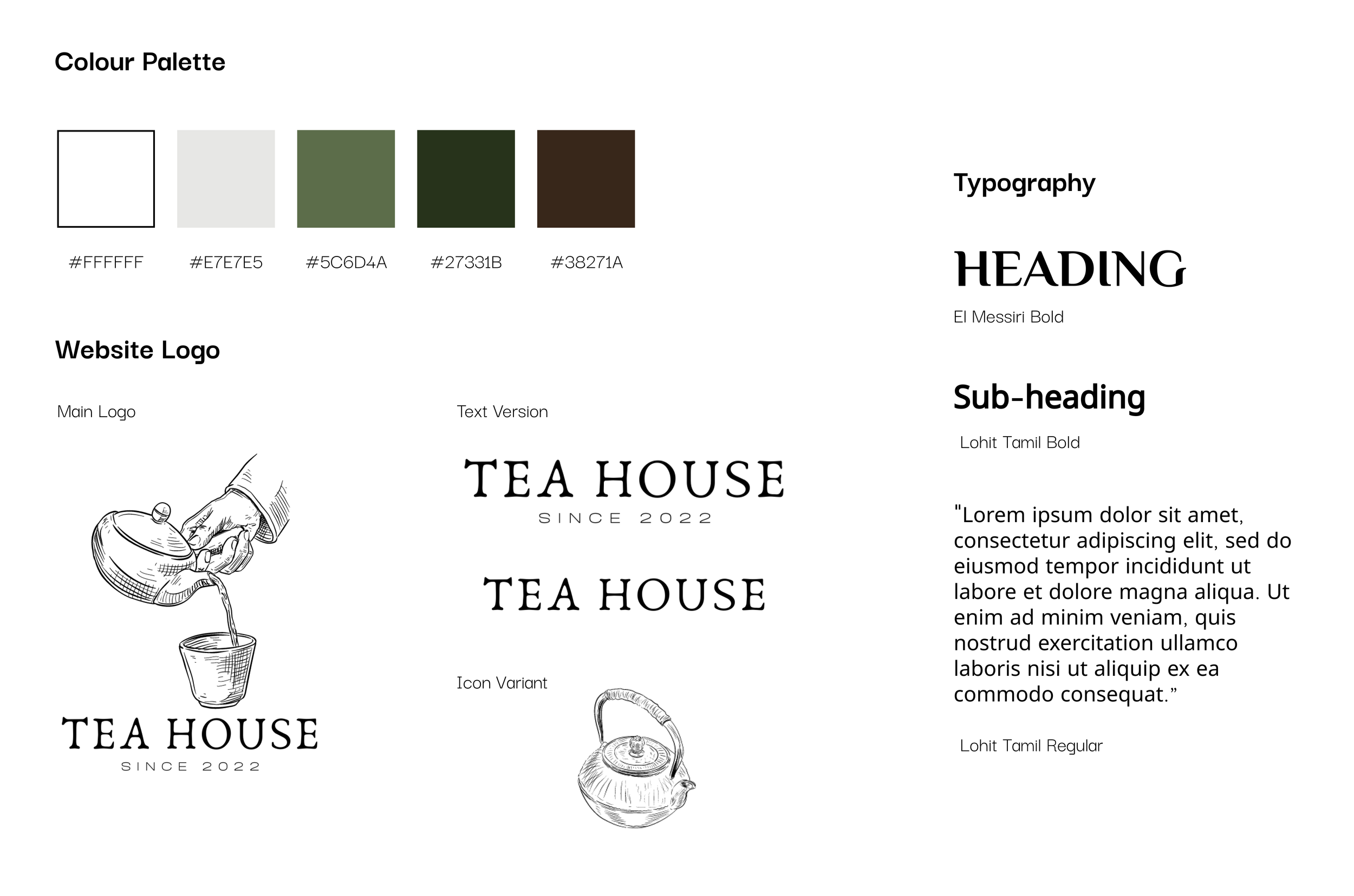
One of the main takeaways from the survey and competitive analysis was providing users with an interface that was both aesthetically pleasing and enjoyable but most importantly accessible and with enhanced usability which is why careful attention was placed when creating the style guide.
The colour palette selected evokes a sense of calmness with hues of green and brown also reminiscent of a tea plant to remain consistent to the branding.
Design & Usability Testing
I begun developing the prototype as a reference to the coding stage and conducted A/B testing...
Low-Fidelity Sketches
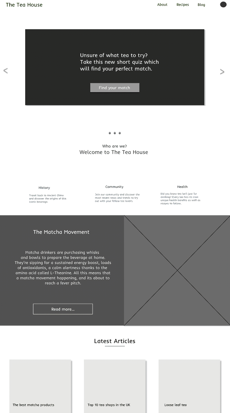
The design process began with quick paper sketches of the UI wireframing to plan out the overall layout of the website and its content. It was decided to focus on a minimalistic approach with a nature and tea inspired colour scheme to create a calming experience comparable to that of drinking a warm cup of tea, however still ensuring that the colours are accessibility compatible.
The paper wireframes were then developed into two separate prototype alternatives to be tested within the A/B usability testing environment followed by the finalised development of a completed prototype and a final follow-up usability testing for any evaluations.
Mid-Fidelity Prototype
Final Design
Version B
90% of participants felt an increase in satisfaction when interacting with Version B as opposed to Version A.
Participants exhibited a great preference for incorporating smaller details throughout the website. Within Version B of the home page example, they appreciated the addition of a summary of the trending articles from the blog section.
75% of participants viewed that version B was more modern and from a purely aesthetic standpoint, preferred the layout compared to Version A.
Upon conducting the A/B testing, I went ahead and finished finalising the main design for the mid-fidelity prototype which was then used to develop the final version.
A/B Testing
To stray off from the usual strategy of conducting usability testing within the design stage, It was decided to create two alternative versions of the prototype in its low-mid fidelity stage and present them to the survey participants to compare the two and allow for feedback to determine which would be ultimately more preferred and successful in meeting the objectives of this project.
An example has been presented for both prototype examples, Version A consisted of a more simple design without much thought whereas Version B took a more intricate approach which paid particular attention to the small details.
Version A
Key Findings
Front-End Development
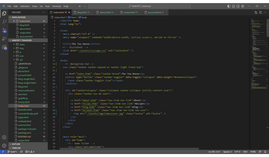
Now that the prototype was finalised it was time to recreate it through front-end development.
The entire purpose for this university assignment was to not only design a food-related website but to also create a functioning version using front-end development such as HTML, CSS and JavaScript.
As this was my very first attempt at coding and developing a website, the design had to be simplified to realistically be able to produce a working website within a four month window.
Conclusion
Although the website is not perfect, as a first coding project, it was a success.
As this was my first time delving into any sort of coding it was quite the challenge, especially within the design aspect. As a UX designer, my priority is to always ensure that the product is visually appealing and successful but often times many do that without realising the limitations that could arise from the technical side of the project, this is what I faced when I initially developed an idea for this website only to realise it was not possible through programming which is why I had to work to simplify the design for the coding aspect but nonetheless, as this was primarily a front-end development assignment I feel proud that I was able to produce a functioning website.
Although initially I struggled with this assignment as I felt it was outside of my comfort zone as a designer, I am still glad that I undertook and tried my best as I believe any designer should have at least somewhat of a knowledge when it comes to the technical side of the project to be able to understand your teammate’s side of things and design with their limitations and possibilities in mind for a more cohesive final product.
Project Takeaways
Moving forward, I will be undertaking more classes and outside lessons related to programming to continue deepening my knowledge of this side of the industry alongside my work as a UX designer and have already begun working towards my next assignment of utilising coding used in the gaming industry within the Unity software.
Next Steps


