Napier University Internship
Improving the Open Day experience for prospective students at Napier University through navigation
Project Type:
University Internship Employer Project
Role:
User Research Brand Design Signage Design
Tools:
Figma Adobe Illustrator Microsoft Forms Excel
Duration:
5 Months April 2024
Overview
How can we improve the Open Day experience of a complicated campus?
Edinburgh Napier University gains the attention of hundreds of prospective students each year. However with the growing competition between the city’s universities, Napier has been working towards enhancing the experience of the students during the Open Day in hope’s to leave a positive impression. It’s Computing and Design Campus, Merchiston is notoriously known for its complicated architecture which leads to confusion from new-comers and visitors which can impact the overall experience. The University has scouted me through an internship to research into this matter to provide data and possible solutions in the forms of Maps and Signage.
Problem Statement
Each year Napier faces challenges stemming from navigation issues, particularly within the Merchiston Campus. Existing signage and mapping solutions were deemed insufficient and non-existent, leading to a disjointed experience for prospective students and visitors. The university sought to address these shortcomings through improved design and navigation solutions to enhance the overall open day experience and better showcase its facilities and offerings.
Solution
User research was conducted to identify pain points and requirements, followed by the development of mock-ups for new signage and mapping solutions. This process incorporated stakeholder feedback and utilized design principles to create user-friendly and visually appealing navigation aids. By implementing these solutions, Napier University now has a temporary solution creating a more welcoming and informative environment for prospective students and visitors as they currently develop more permanent means.
Research
A student survey followed by stakeholder interviews were organised to delve into the pain points and solutions.
Student Survey
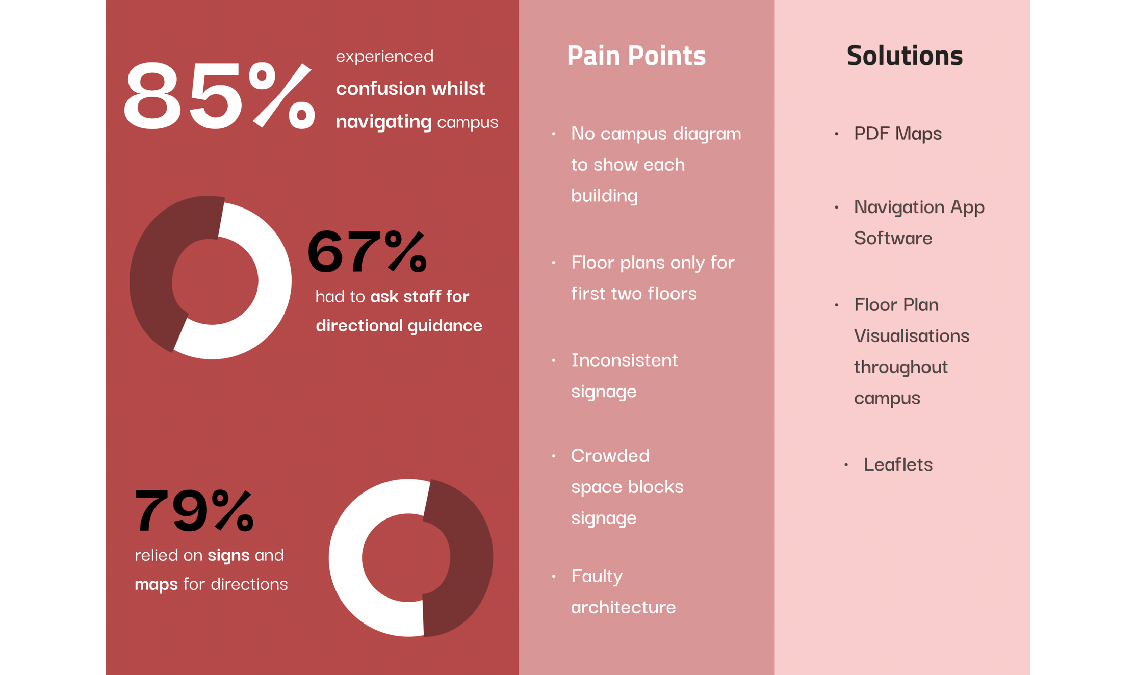
An online anonymous survey was issued out to 11 current students at the University to gain insight into their personal experiences with the previous Open Day’s in general as well as with a focus on the navigation.
Objectives
Discover the success rate of materials provided to prospective students ahead of the Open Day (i.e navigation guidance, tickets etc)
Establish the success and pain points of each student’s experience throughout the Open Day from start to finish
Enquire about the experience in perspective of Campus navigation and assistance tools
Findings
Stakeholder Interviews
Alongside the employer, a list of relevant stakeholder’s was organised to identify their requirements and pain points. 5 Stakeholder’s were interviewed including the University’s Head of Student Recruitment, Events Organizer and the Head of Creative.
Objectives
Gain unique background knowledge of the problem situation from the perspective of the stakeholders in terms of the Open Day’s, current signage and previously attempted improvements.
Establish their individual pain points and personal requirements from the project.
Present hypothetical design solutions previously prepared to receive feedback and criticism.
Findings & Analysis
Many solutions were attempted previously with little improvement. A more advanced fix is necessary to tackle this issue.
Thematic Analysis
A thematic analysis was developed to organise the transcript data of each stakeholder interview based on the previously mentioned interview objectives.
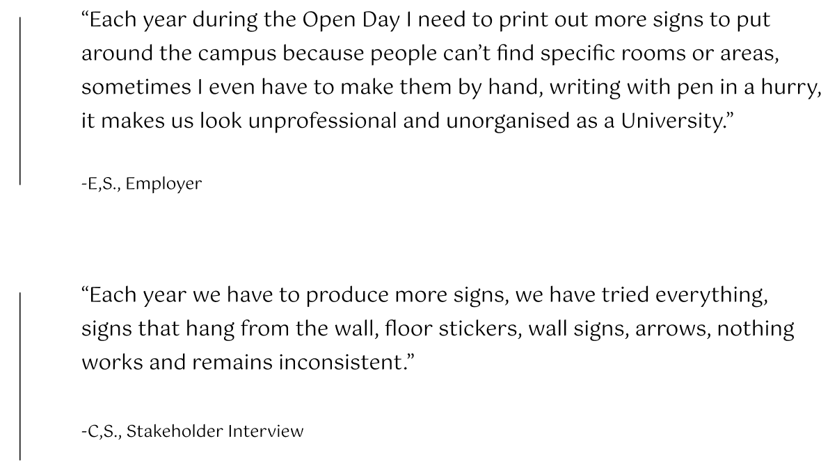
Each stakeholder shared their personal experiences with the annual Open Day at Merchiston Campus and admitted that the navigation issue is still prominent and poses issues each year
Several solutions were attempted such as a variety of signage types, commissioned maps as well but with little success
Overall, the issue lies within the faulty structure of the Campus which turns fully functioning signage, useless; thus, a more advanced solution is needed such as an app which is in the future plan
The presented design solution was received positively by all.
Affinity Diagram
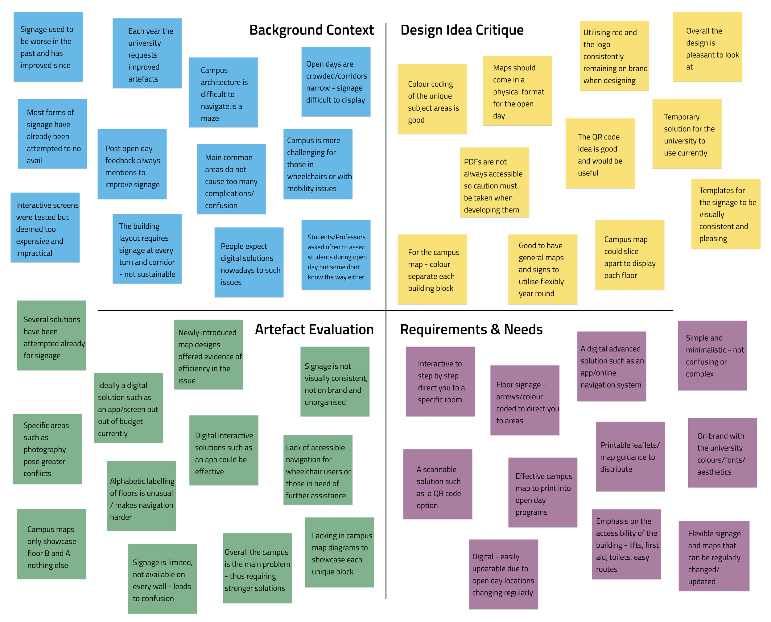
An affinity diagram was additionally included to support the data organised within the thematic analysis, consisting of relevant quotes from the stakeholder interviews.
Persona
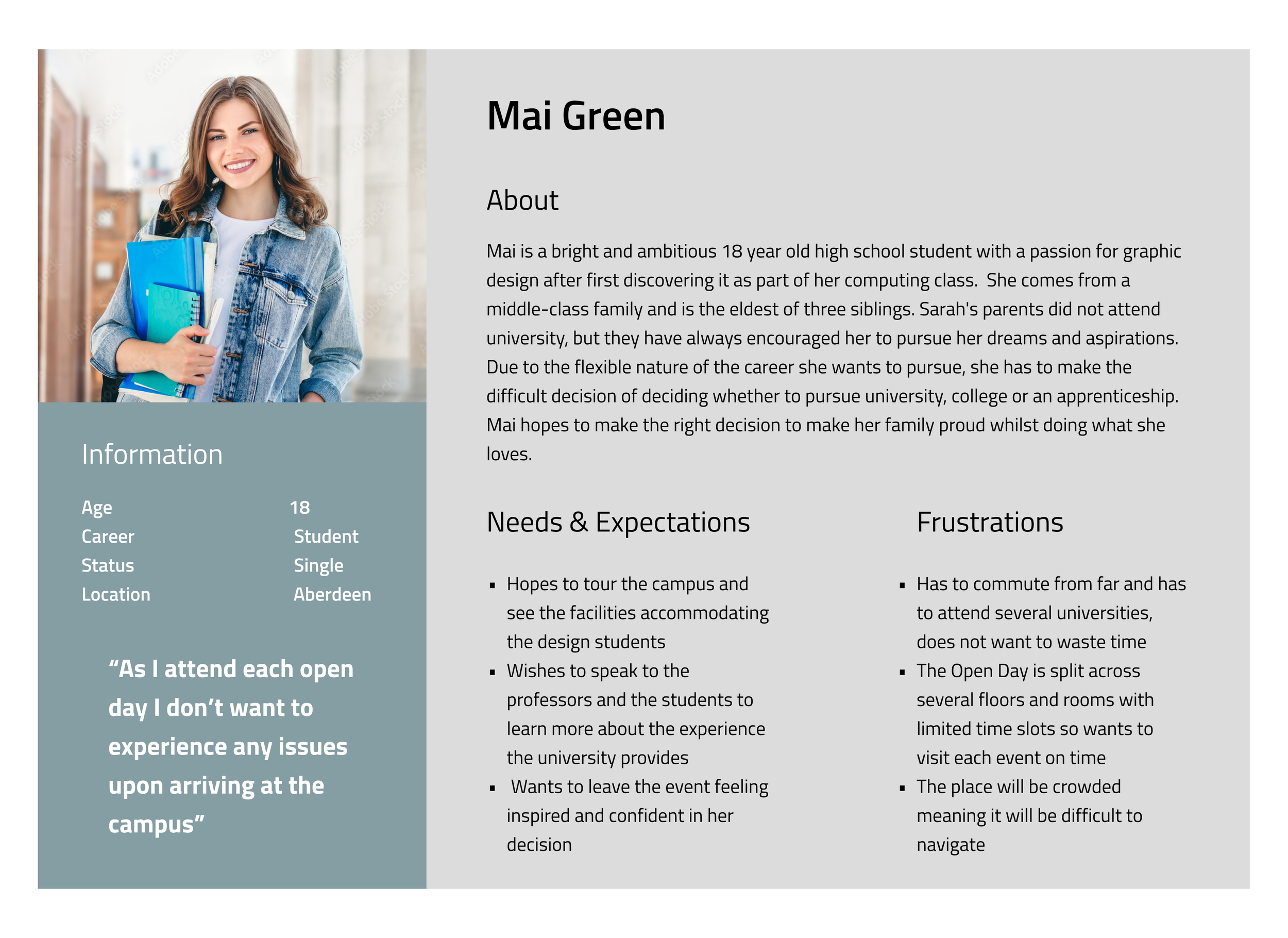
Based on the student survey responses, a persona was developed to summarise the common themes within the analysed data to promote a sense of empathy moving forward whilst working towards creating solutions.
User-Journey Map
A user-journey map was developed to present a visual representation of a student’s journey during the Open Day at the university to gain a better understanding of where the issue arises.
Empathy Map
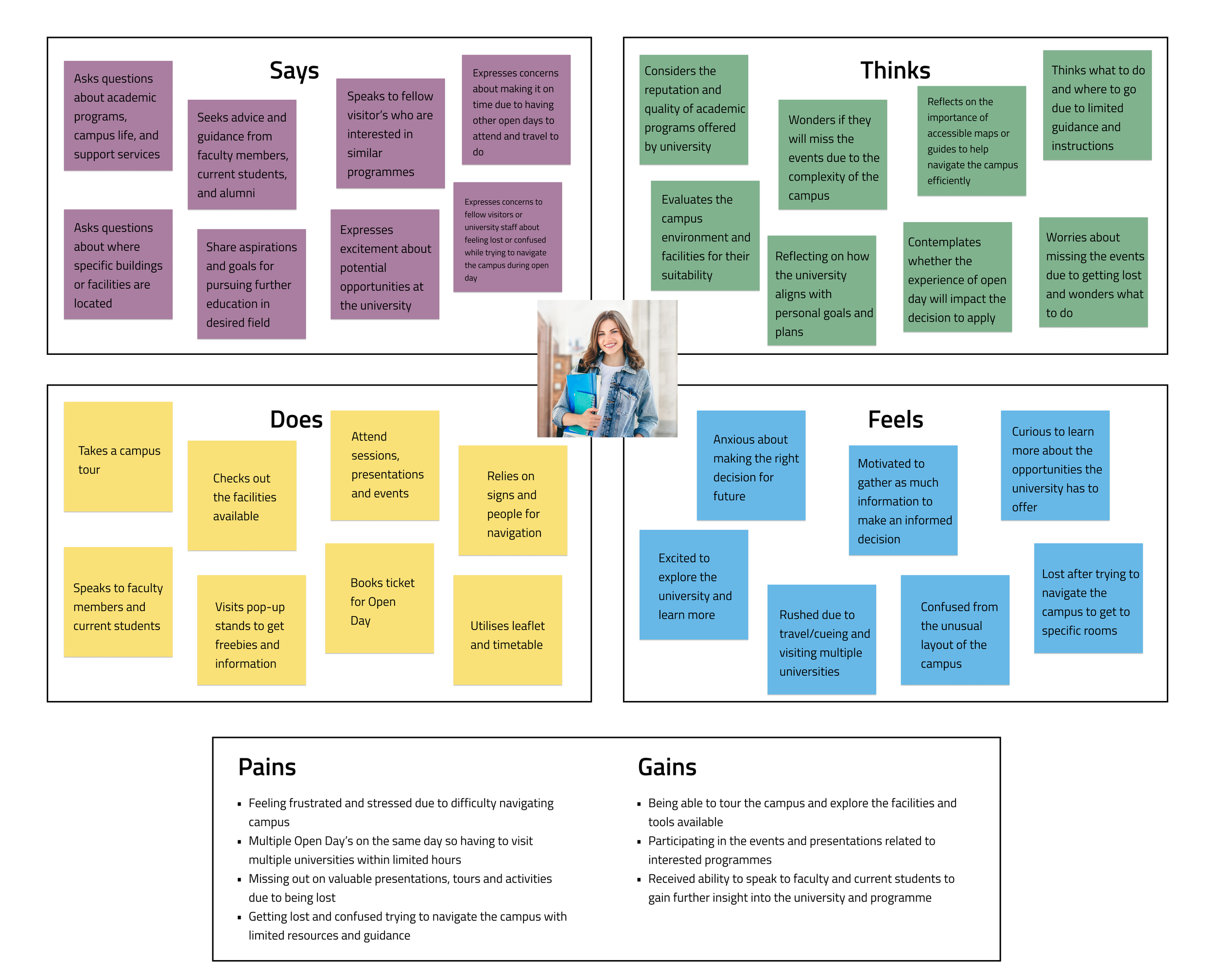
Utilising the quotes gathered from some of the survey questions, an empathy map was created to further gain an understanding of the experience students underwent through ought the past open days.
Ideation
So how can we begin to improve the University’s Open Day Experience?
The research conducted ultimately revealed the issue to be larger than initially expected, although not ideal, the problem did not lie in faulty signage but rather within the building itself, due to its complicated and faulty architectural structure, all signs and maps by default become insufficient, explaining why despite the University annually troubleshooting the issue, it is yet to be fixed. Thus it was agreed with the employer as well as the stakeholders that this internship should focus on producing temporary solutions as a more complex idea is presented, perfectly in time for the upcoming Open Day in June 2024.
Employer Requirements
The employer expressed an urgency to focus on two key issues. The signage through ought the campus lacked visual consistency and were not only aesthetically unpleasant and lacking branding but were also lacking in quantity enabling them useless. The campus also lacked any floor plans or maps.
Produce a campus diagram illustration showcasing each building and its content, labelled and informative
Create labelled and colour coded maps of each floor, highlighting the Open Day events for improved experience
Improve the current signage by designing an on-brand template
Branding & Style Guide
Using the University’s branding website, a style guide was created to ensure the signage and map designs meet the appropriate standards needed to be deemed its own product.
Design
I begun to develop campus map designs and signage templates.
Campus Map
The initial Campus Map utilised informally by the staff was visually unpleasant and impractical, it needed the most work due to the Campus having several buildings yet no assistance to navigate them.
Initial Mock-Up
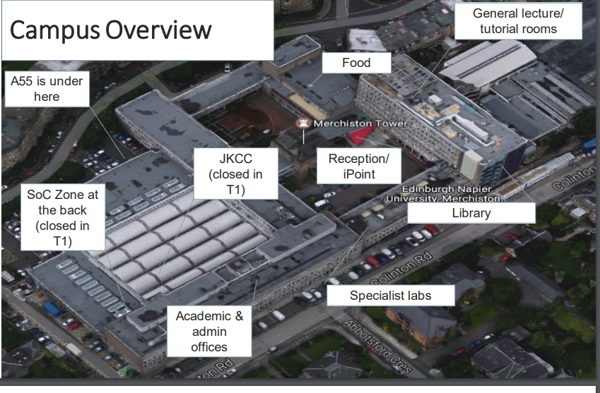
Taking advantage of my digital art equipment, an accurate illustration was developed of the campus at an angle to showcase clearly each building section as well as the courtyard, a significant improvement from the image above.
Campus Map Finalised
The previous design was presented to the employer as well as the stakeholder’s and feedback was given to make necessary improvements before finalising the design mock-up.
The overall angle and style of the previous design was appreciated as the University does utilise sketch-like designs throughout their media so that remained unchanged -
The linework and detailing was simplified to focus on the overall shapes of the unique buildings
Colours were replaced, assigning one of each University’s brand colours to each of the buildings to separate them clearly for improved visibility
Key contents of each building were highlighted on the illustration to assist navigation
Floor Map Design
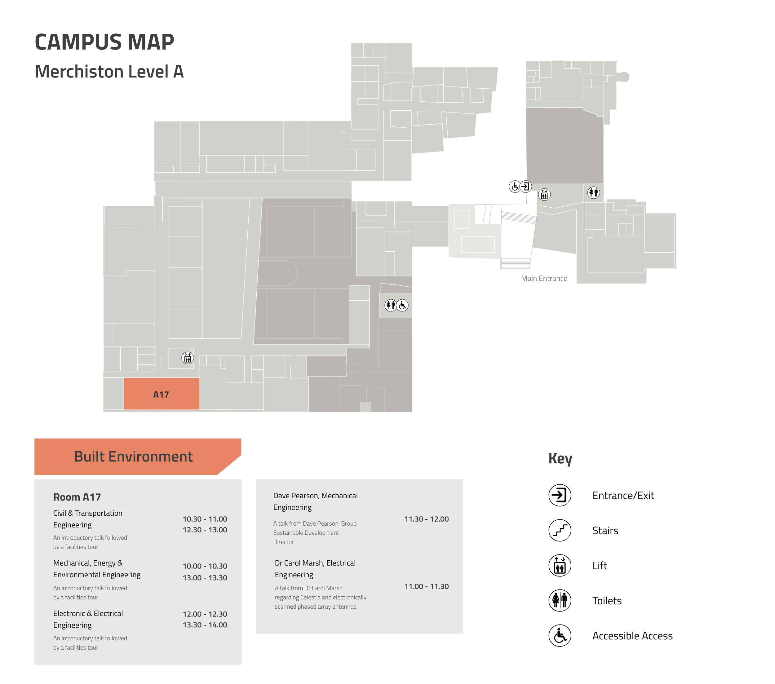
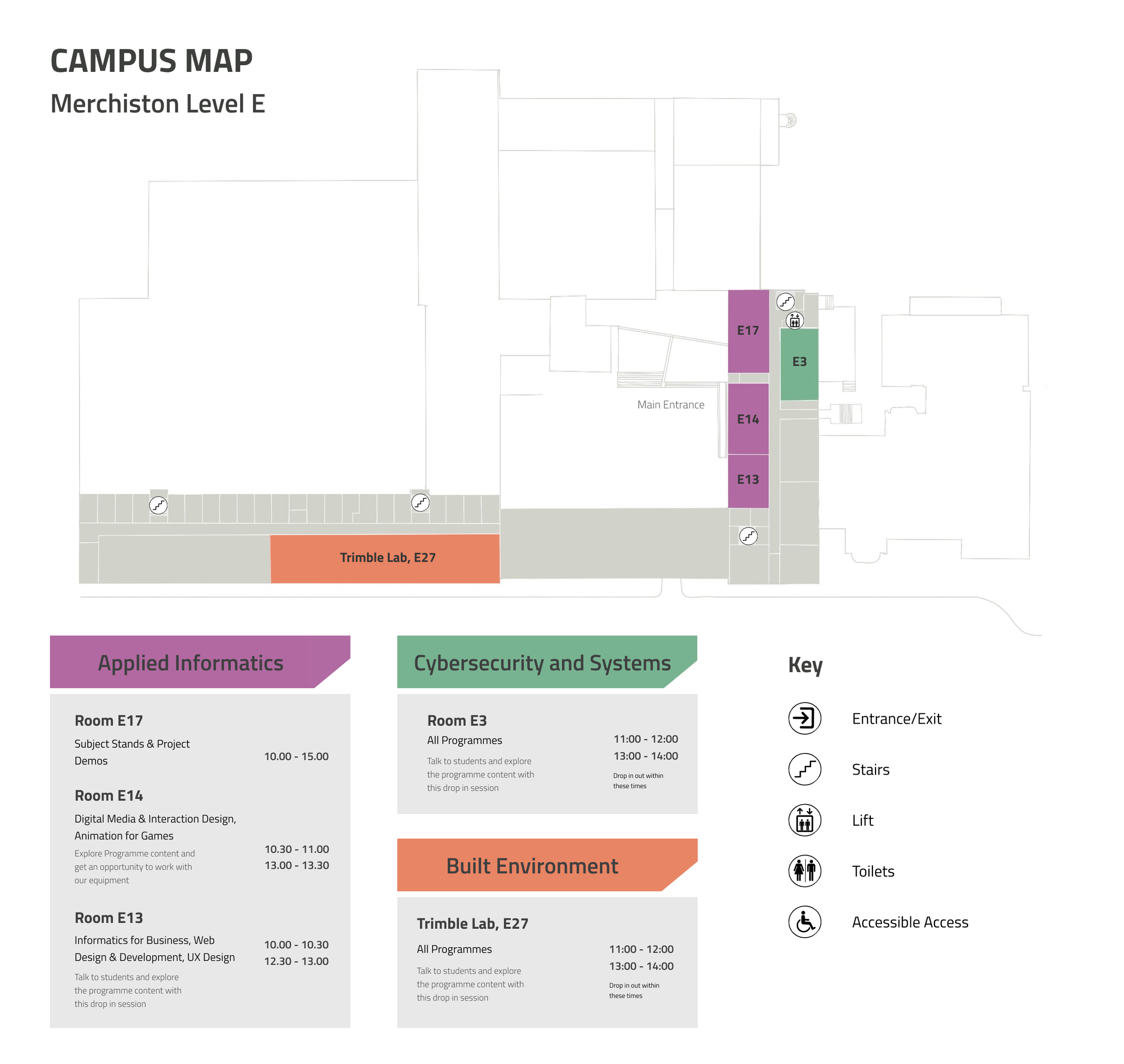
In 2023, the University commissioned floor map designs however it was deemed unsuccessful by the stakeholders and their own research due to its design and lack of quantity as only two floors were designed for. Overall, visually I found the design pleasing as it incorporated the complimentary colours of the University’s branding so I decided to maintain its essence, however replacing the unnecessary colour coding of things such as toilets and exits with a map key and symbols to minimise overwhelming the person looking at it, instead focusing to highlight the events of the Open Day and which room they are located in.
Overall, these maps when presented to the stakeholders as well as the employer were appreciated both from an aesthetic standpoint as well as functional, the maps not only highlight the events related to the Open Day as well as providing a clear schedule but it also highlights key areas of the Campus the visitors could take interest in such as the library or cafeteria.
The employer had no complaints regarding this design and asked for a general editable file of each to utilise outside of the Open Day for everyday usage by students and visitors.
Sustainability
To reduce waste and meet the sustainability requirements of the University as it is an issue that must be considered, a PDF idea was proposed, to contain all the maps and information each student may need in order to navigate across the campus to the several events held that day, students would receive the file via e-mail upon booking their online ticket.
For those who did not receive an e-mail, a poster with a scannable QR could was developed to hang across the campus allowing people to receive the maps on their device to keep.
Signage
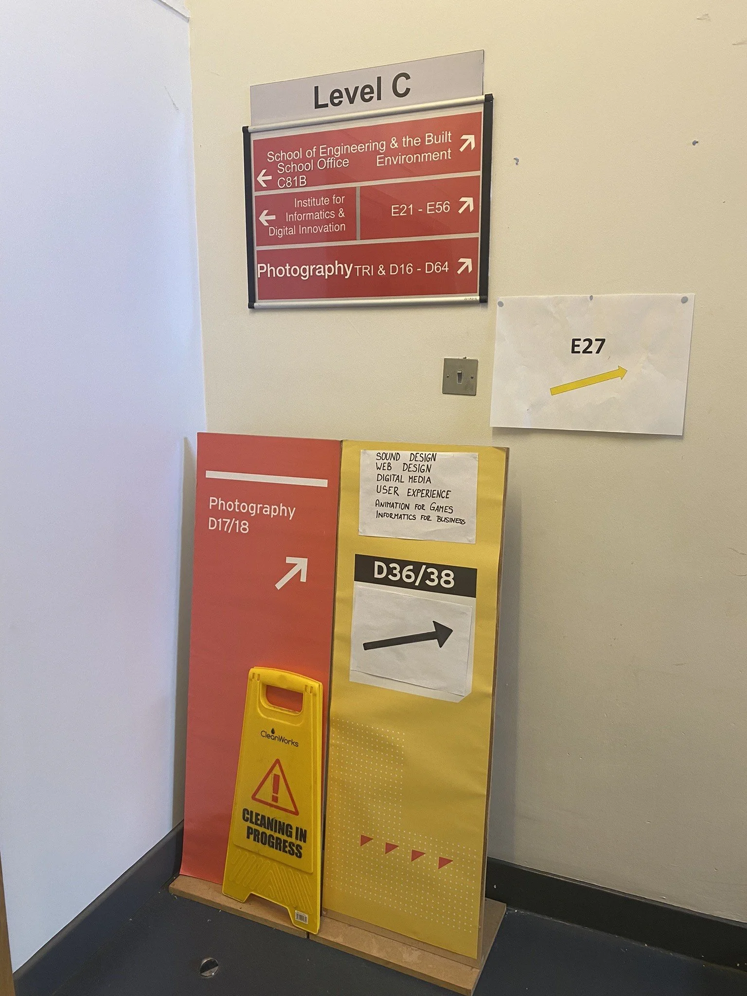
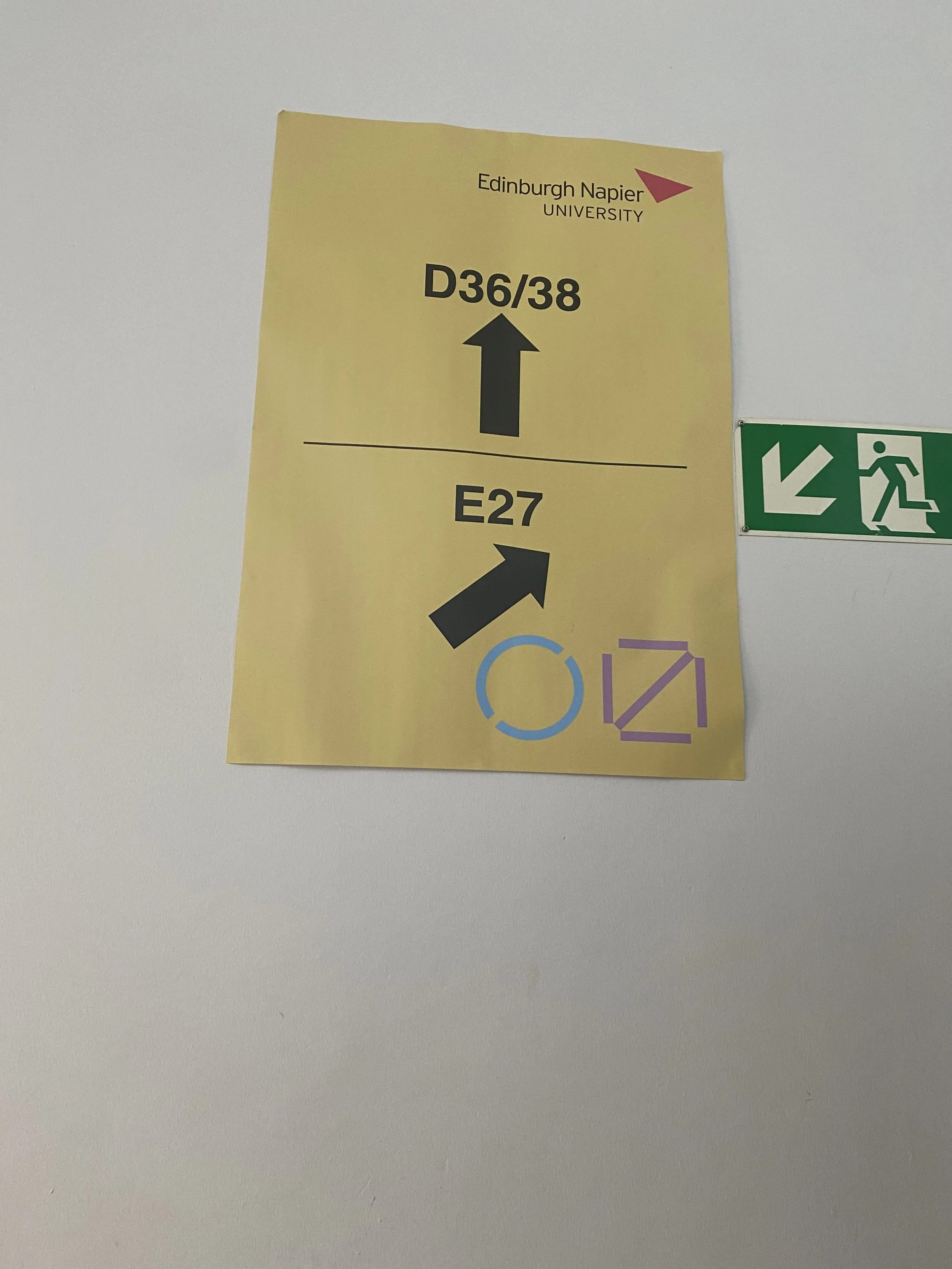
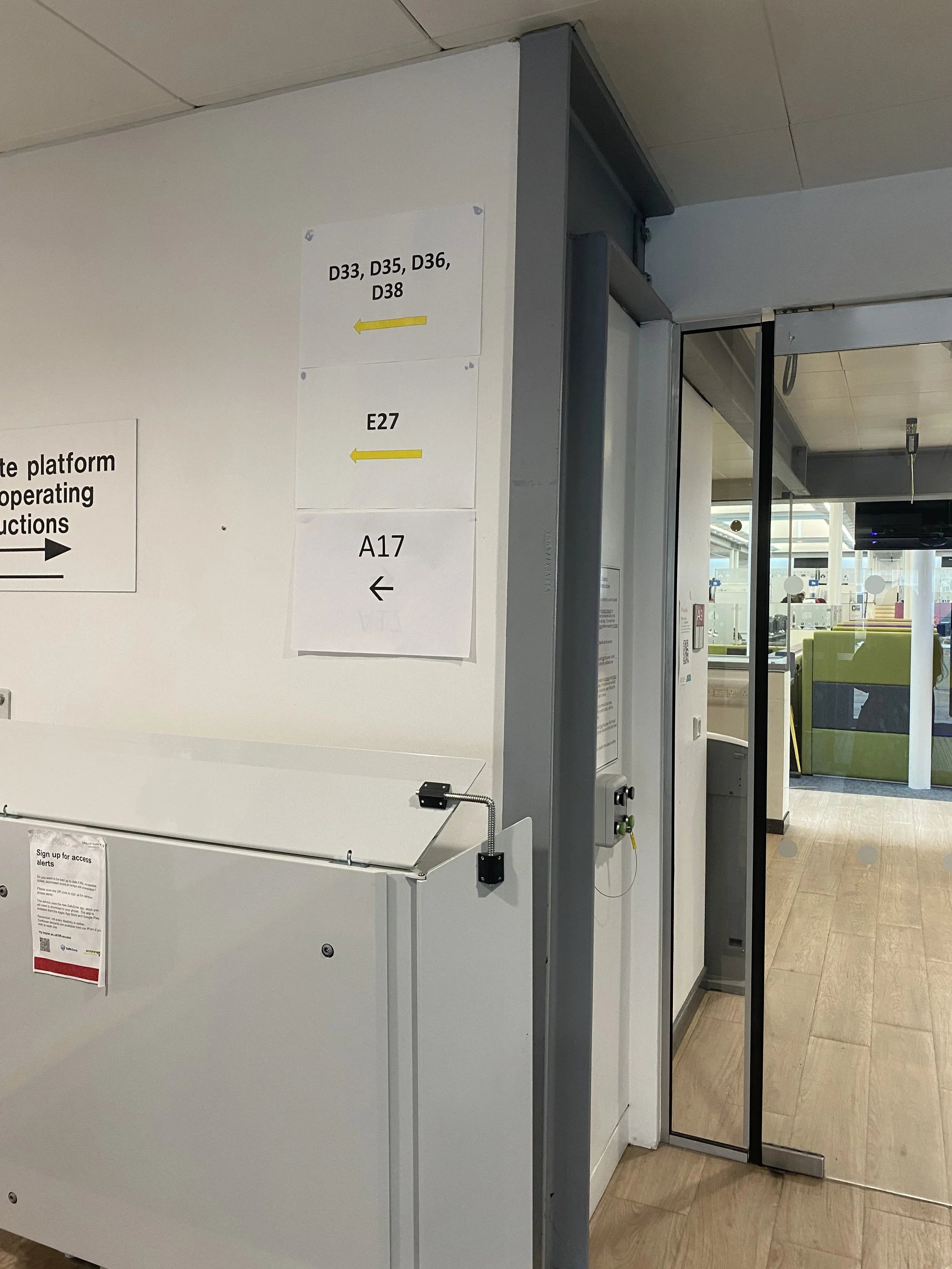
The employer expressed great frustration towards the signage located within the campus due to its inconsistency, the main issues were that there were simply not enough signs. On each floor signs would be provided, directing the visitor to a certain room only to run out half way through, signs would be placed in areas with low-visibility and due to this, each year, staff must print out more signs in urgency, thus creating an unpleasant appearance with inconsistent designs and layouts, signs come in different shapes and sizes and overall fail to do their job.
Signage Design
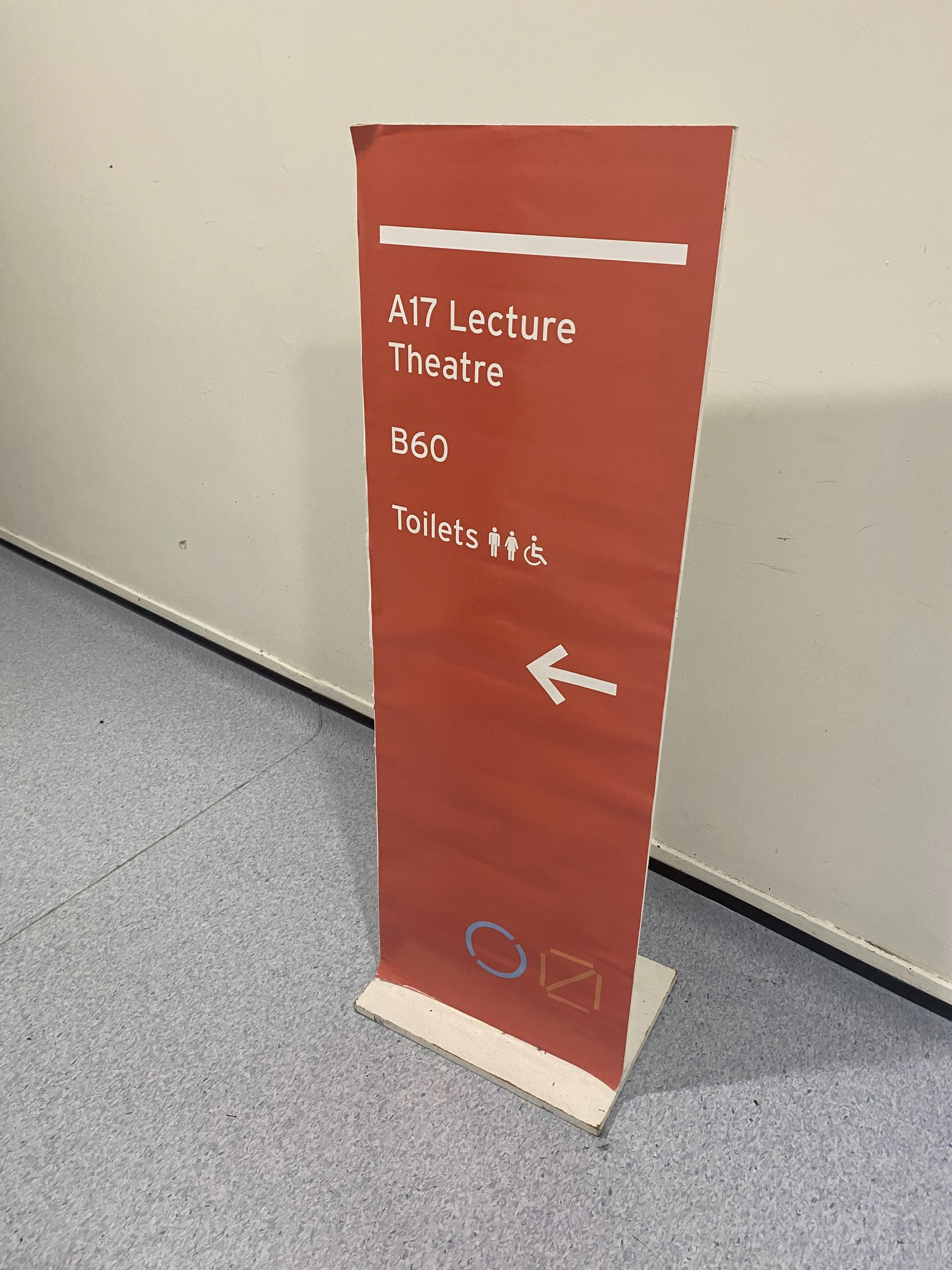
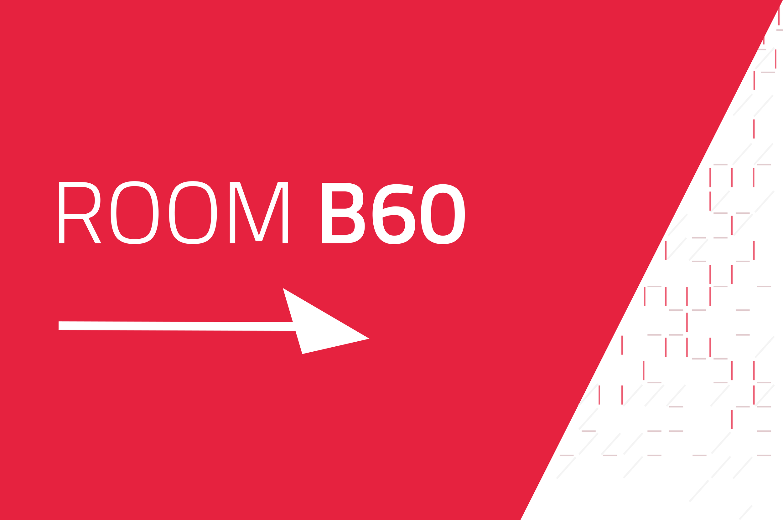
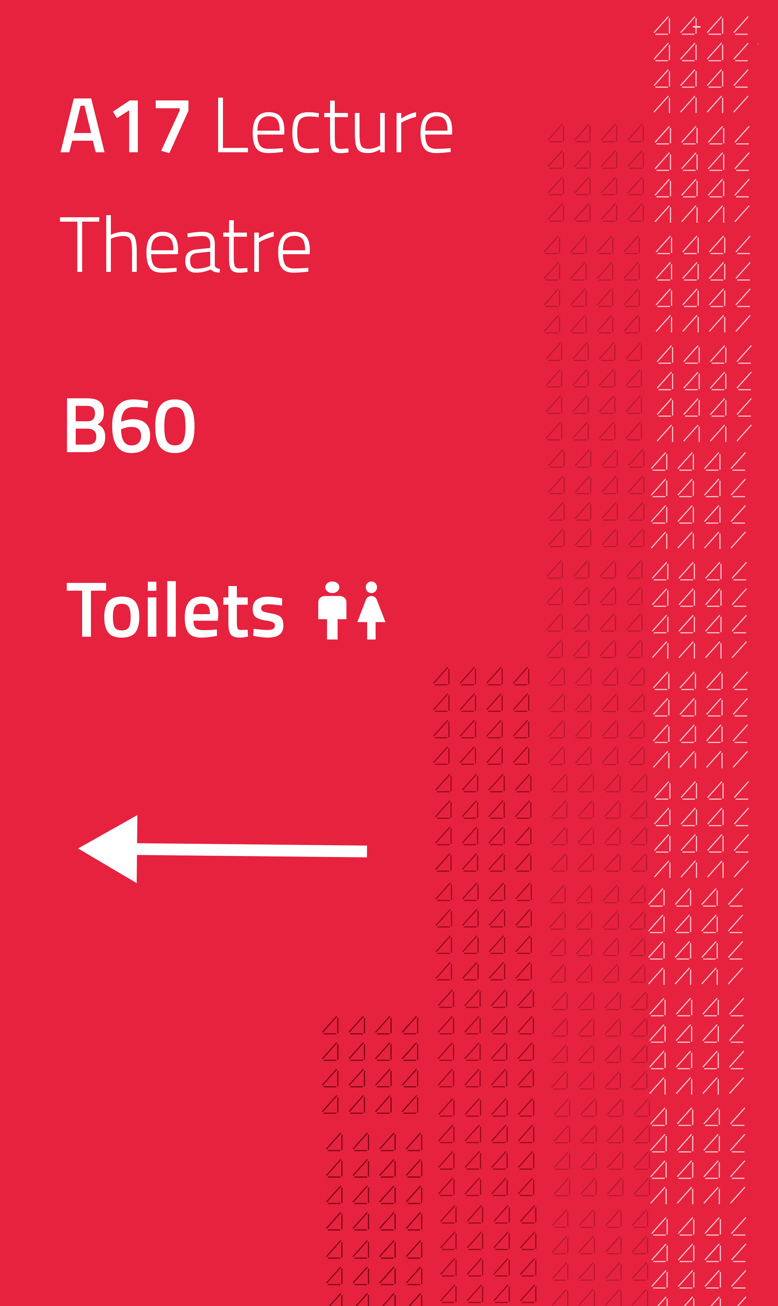
The employer requested a template which could be used throughout all the signage in the campus to tackle the inconsistency, the signage should be eye-catching, simple but also on-brand for the University.
I developed a few versions for the employer to choose from.
The signage features the official red colour of the University making it stand-out and eye-catching thanks to its brightness
The text was kept simple, emphasising the room numbers in bold with the help of arrows to guide further
The University’s logo was incorporated throughout each design as a pattern
Usability Testing
The designs were tested during a University prospective student event.
Usability Testing Findings
Upon the employer’s request, the designs previously presented were tested during a small prospective student event amongst 10 students. The test aimed to get a glimpse into how the new signage design as well as the newly developed campus floor plans efficiently helped the participants navigate the campus for the first time.
The design of the signage was deemed more visually appealing compared to current signs across the campus due to consistency and on-brand bright colours which enable the signs to stand out from a distance.
The Campus map was appreciated due to the campus having 4 joint buildings with no information externally or internally what each one contains, assisting the participants to enhance the navigation experience in the beginning
The floor plans were proven to be successful however some confusion still lingered amongst the participants due to the severely faulty campus architecture
Further work could be done to highlight certain aspects of the campus such as accessibility features, specific key areas and rooms with visual navigations throughout the campus and colour coding
Conclusion
The internship may have ended but the university still continues working towards a permanent solution...
This internship was a challenging but ultimately rewarding journey. I came into it with little real-life project experience, and paranoid about facing the seemingly impossible task of designing within an unfamiliar field for a building that professionals have failed at, yet nonetheless it was an experience that pushed me in several ways. As a researcher, it sharpened my skills, teaching me the fundamentals of managing the unpredictable nature of user research, it pushed me as a designer who had to flexibly adjust their UX and design knowledge to fit a field of design that I never dealt with and overall I came out of this, a more confident person, willing to take risks and step out of my comfort zone to assist people in any way that I can as a good experience isn't always just in apps.
The project yielded several valuable takeaways. Firstly, it honed user research skills, enabling the application of various methodologies to understand user needs effectively. Secondly, there was a notable improvement in design proficiency, particularly in graphic, brand, and cartography design. Additionally, regular communication and collaboration with stakeholders enhanced interpersonal skills crucial for project management. Furthermore, adept time management and adaptability were essential in navigating unforeseen challenges, ensuring tasks were completed efficiently. Overall, the internship provided invaluable professional experience, preparing for future endeavors in user experience design and related fields.
Project Takeaways
As my graduation soon followed the end of the internship, it was agreed alongside the employer to provide the University with all the research and work developed throughout this process to allow them to utilise it moving forward as they continue to search for a permanent advanced solution to the maze of a campus. For now, I am proud to say that my designs will be used as temporary placeholders which have been able to provide improvements for prospective students, enhancing their experience of the Campus.
Next Steps


